.svg)
.webp)
.webp)
Oops! Something went wrong while submitting the form.
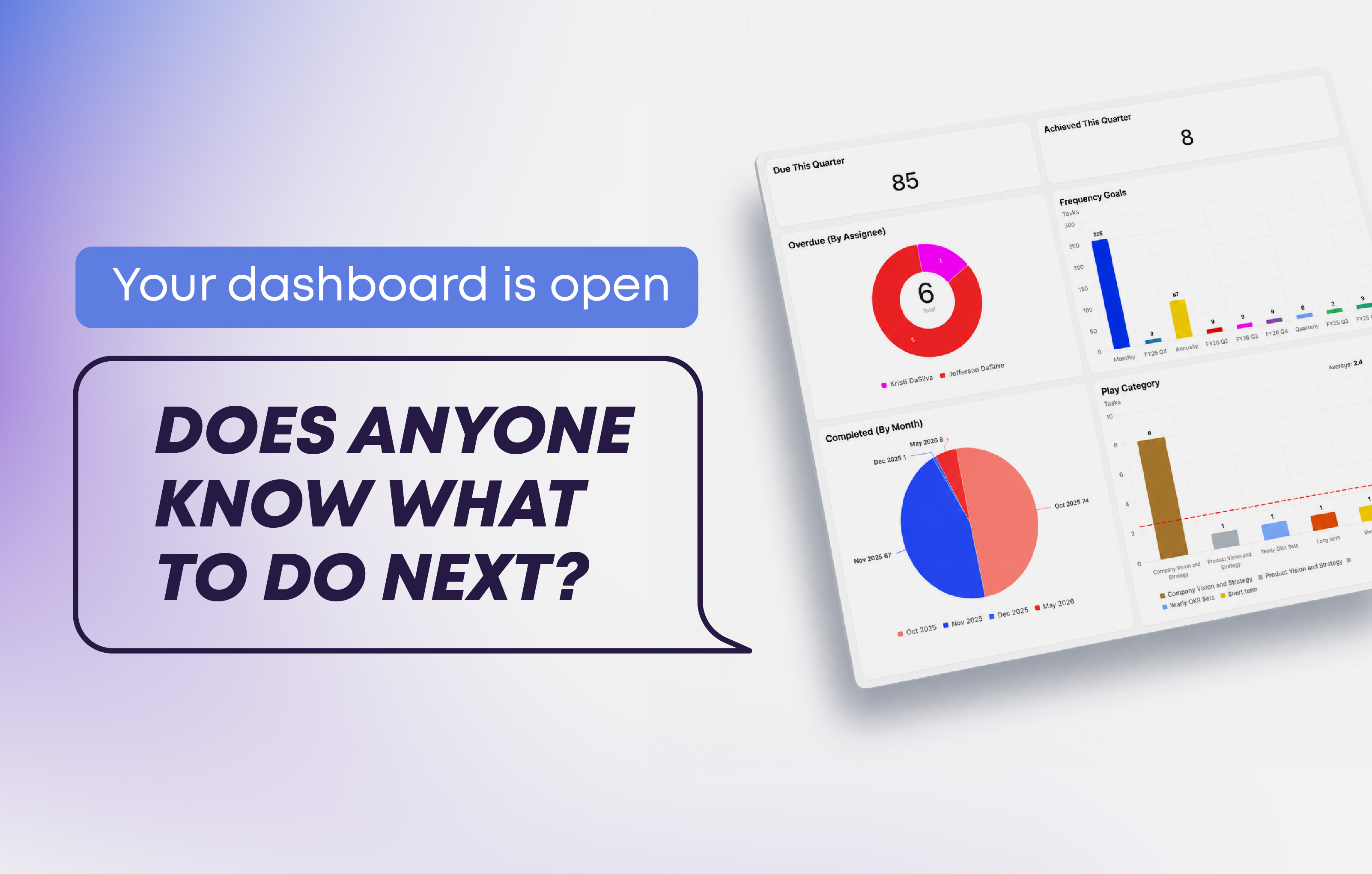
Most teams that use ClickUp have a dashboard. Several, actually. And somehow, by the end of most leadership meetings, those dashboards are open on someone's screen and completely ignored.
ClickUp dashboards are genuinely powerful but the issue is almost always the same: the dashboard was built around data that was available, not around decisions that needed to happen. So you end up with a beautiful collection of charts that tells you what happened, but gives no one a clear sense of what to do next.
This article is all about fixing that. We're going to walk through what a dashboard actually is, how it works inside ClickUp, and how to layer KPIs onto it so that when someone opens it, they leave with a clear next step, not just a screenshot for a slide deck.
There's a useful way to think about the difference. A report tells you what happened. A dashboard tells you what to do about it.
Nielsen Norman Group defines dashboards as single-page views meant to communicate critical information people can act on quickly, specifically not designed for broad exploration or post-meeting archaeology. ClickUp frames them the same way: a high-level visual representation of work, progress, and performance. Both definitions point to the same thing. A dashboard is a decision interface.
In practice, the test is simple. If your team exports screenshots to drop into a slide deck, that's a report. If they open a view and the conversation immediately turns to "who's picking this up?", that's a dashboard.
Before talking about what to measure, it helps to understand the mechanics.
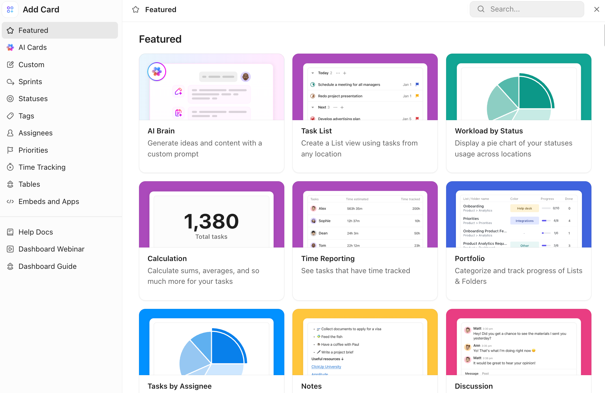
A ClickUp dashboard is a canvas where you arrange cards. Cards are the individual blocks of information: charts, task lists, time tracking summaries, workload views, AI-generated summaries, embedded URLs, and more. When you click "Add card" inside a dashboard, ClickUp organizes them into categories including Featured, AI Cards, Custom charts, Sprints, Statuses, Tags, Assignees, Priorities, Time Tracking, Tables, and Embeds.
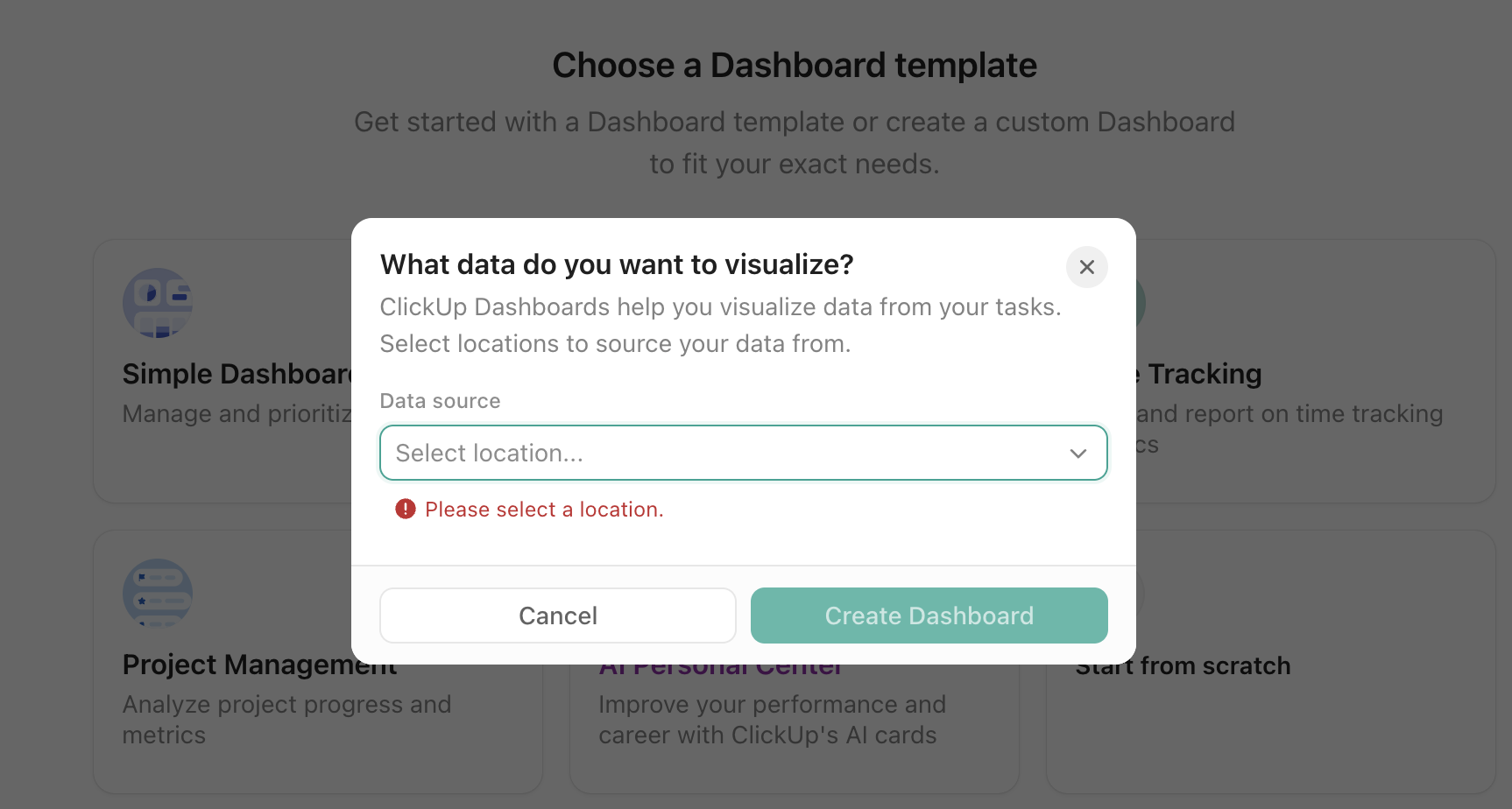
Each card pulls from a data source, which is a Location: a Space, Folder, or List in your workspace. This is one of the most important things to get right early. If someone opens a dashboard and sees nothing, the issue is almost never the dashboard itself. It's almost always that they don't have permission on the underlying data source.
There are also two ways a dashboard can live in ClickUp. The first is a standard Dashboard, accessible from the Dashboards Hub. The second is a Dashboard view, which places the dashboard directly inside a Space, Folder, or List as a view tab, next to the actual work it's tracking. For teams that want their data and their work in the same place without switching contexts, Dashboard views tend to get more consistent use.
A few details worth knowing before you start building. Dashboards auto-refresh, but AI Cards do not refresh automatically with the rest of the dashboard. They need a manual refresh to regenerate. Drill-down works on several card types, including Pie, Bar, Battery, Line, and Task List cards, which means a team lead can click a number and immediately see the tasks behind it. And there's a practical limit of 100 cards per dashboard and 500 rows per overview view, which is another reason to keep dashboards focused.
Filters are your main tool for keeping one dashboard useful to multiple audiences. You can apply a Dashboard filter that adjusts all supported cards at once, or set card-level filters for more specific logic. This means an executive and a team lead can look at the same dashboard with different filter settings and each see what's relevant to them, without you building two separate dashboards.
The most common dashboard mistake is opening ClickUp and starting with charts. The right starting point is a decision.
What recurring choice should this dashboard support? This is not the same as what data should this dashboard show. It means: what question does this team ask at their weekly meeting, and what would a clear answer look like? For a client delivery team, that might be "which projects are at risk of missing a deadline this week?" For a sales team, it might be "are we going to hit our number, and if not, where is the gap?"
Who is the actual audience? A dashboard built for a CEO and one built for a project manager should not look the same. The CEO needs signal and direction. The project manager needs detail and action paths. Mixing both usually serves neither.
What filters define the scope? Before anything else, decide what "in scope" means. Is this dashboard about this quarter only? Active projects only? One specific team? Getting this wrong means your dashboard will always feel slightly off, like it's showing you too much or the wrong things.
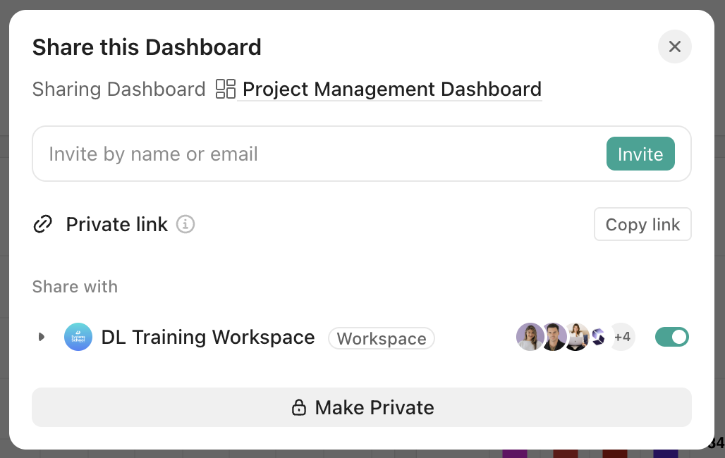
Who needs to see it, and do they have permission on the data source? This is the step people skip, and it explains most of the "my dashboard is empty" situations. Sharing the dashboard link is not enough. The person also needs access to the Lists, Folders, or Spaces the cards pull from.
There's a distinction worth making before you start adding cards. A metric is any number you can track. A KPI is a metric tied to a specific objective, one that should change how you act when it changes. The test is simple: if this number goes up or down, does anything you decide or do change? If the honest answer is no, it's just a number living on your screen.
The reason this matters is that most teams end up with more data than they need and less clarity than they want. Tracking what's visible is easier than figuring out what's meaningful, and dashboards have a way of accumulating both equally.
.png)
Most teams track too many things on a single dashboard. Somewhere between five and eight KPIs is a useful ceiling for any one view. More than that and attention gets scattered and everything looks equally important, which means nothing actually is.
Within those five to eight, a healthy KPI set balances two types of signals. Leading indicators are the early warnings, the numbers that predict where you're heading before you get there: demos booked, qualified pipeline, website traffic, content published. Lagging indicators confirm what already happened: closed revenue, completed milestones, churn rate, project delays. You need both. Leading indicators alone can create false confidence. Lagging indicators alone mean you're always finding out after it's too late.
.png)
What those KPIs look like depends entirely on who the dashboard is for. A leadership team might center their view on revenue progress, margin, and whether strategic goals are on track across departments. An ops lead cares more about what's overdue, who's overloaded, and where work is piling up. These are different audiences asking different questions, and trying to answer all of them on one screen usually means answering none of them well.
.png)
Whatever the audience, thresholds are what give the numbers context. Without them, every person opening the dashboard has to decide for themselves what's normal and what's not. With them, that work is already done. "Our close rate is 28%" is just a fact. "Our close rate is 28%, which is below our 35% threshold" is a flag that needs a conversation.
The difference usually shows up in the first five minutes of a meeting. A dashboard built around available data gets explained before it gets used. A dashboard built around a decision gets opened, and the conversation starts.
The version that works tends to be smaller than people expect. A number that flags what needs attention. One click that takes you from the signal to the tasks behind it. An owner already assigned. By the time the meeting starts, the question isn't "what are we looking at?" It's "who's handling this?"
That shift, from orienting to deciding, is what a well-built KPI dashboard actually changes. Not the amount of data your team has access to, but how quickly they can move from seeing something to doing something about it.
Getting the structure right before you build saves hours of rebuilding later. If you're not sure which KPIs to track, how to set up your data sources, or how to get your team to actually use what you build, that's exactly what we help with.
Book a call with our team and we'll walk through your setup together.
.webp)


.webp)

